User Experience Mapping — How to Get on the Same Page Quickly
Create a User Experience Map as a “work smarter, not harder” technique to get Product Managers, Designers, Engineers, Subject Matter Experts and Customers on the same page.

User Experience Map example. Blurred to protect proprietary content.
Constant communication….Slack, email, text, video chat…does not guarantee that Product teams stay on the same page. Making a User Experience Map together will create a shared understanding amongst team members that’s more valuable than the most well written user story. The map can be used as a resource for current and future product planning.
New ideas can be added to the map to see their potential impact
A map representation of the user experience more effectively educates stakeholders, solicits productive feedback and drives buy-in
Off topic ideas are more obvious when teams have created well-vetted maps
Use the map to focus your stakeholders. It will make their ideas even better and make them a more useful part of the product creation process.
Example — Bluetooth location-based messaging
At one client, we used the user experience map to discover a core problem. The topic was the sending of location-based messages to users. The problem was that users weren’t reading the messages. As we mapped the user experience, we realized just getting the app to “see” the bluetooth location beacon was preventing messages from ever arriving in the first place.
Having the lead engineer in the meeting helped the team dive down into the exact steps for the user map that seemed to be causing the issues. By the end of the session, it was clear that it wasn’t the content of the message to blame (our initial hypothesis) but actually the mechanism for getting the app to see the bluetooth location beacon.
We used this analysis to go into the field and do user testing to understand more about this problem. We encountered a many users who told us that they don’t have bluetooth turned on in order to save battery life (even though the type of bluetooth used in location services uses less than 1% of battery). In this instance, the map focused the team on the most pressing need. It wasn’t the sexiest need to work on but it had to be solved before they could move on.
Make shared understanding, not war
It’s key to create the map together. Many product managers or UX designers do this important work on their own. Don’t just make presentations to your colleagues, get them involved in the process itself. Creating a user experience map as a group exercise is a safe, non-confrontational (generally) way to generate buy-in along the way and make the resulting product or feature better. It also reduces conflict later in the process if you try to do big reveals of functionality to un-socialized stakeholders. Contrary to popular opinion, the team doesn’t even need to be in the same room. I frequently facilitate these sessions remotely with remote team members. Doing this work in a group setting does get messy. But the messiness is the beginning of coalescing different opinions. Having a product manager, UX designer, lead engineer and a domain expert in the session at the same time will generate shared understanding and buy-in at the same time. And best of all, the product team will learn, learn, learn about their user while achieving the nirvana of collective or shared understanding about your user. Very few of the teams I work with take the time to do this exercise even though the alternative is just assuming everyone is on the same page. Instead, they rely on shared documents or even worse, verbal or non-verbal (ie, not discussing at all) communications of the user experience. Jeff Patton said it best: “Shared documents are not shared understanding”…in his book User Story Mapping.
What the map tells you
The map creates a horizontal funnel for the user journey (most of my maps are created in a horizontal left-to-right format). It fits the funnel analogy since there will be more people starting the journey than reaching the goal. So the left side of your map is generally full of “top of funnel” ideas and the right side of the map generally has “bottom of funnel” ideas. The “top of funnel” ideas often have the most impact on a business since it drives more users through existing flows, leveraging previous software products.
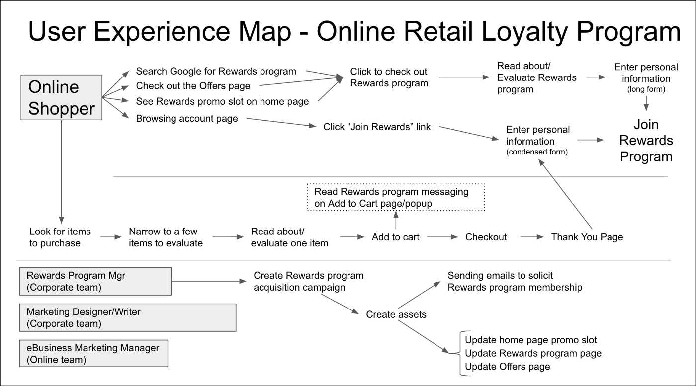
Example Map — Online Retailer Loyalty
These maps are simple but when made together, they create valuable Shared Understanding amongst team members and stakeholders.
Inspirations for this blog post:

Jim Morris, Product Discovery Group
Jim coaches Product teams to collaborate with each other and seek customer input early and often during the design and ideation phase.